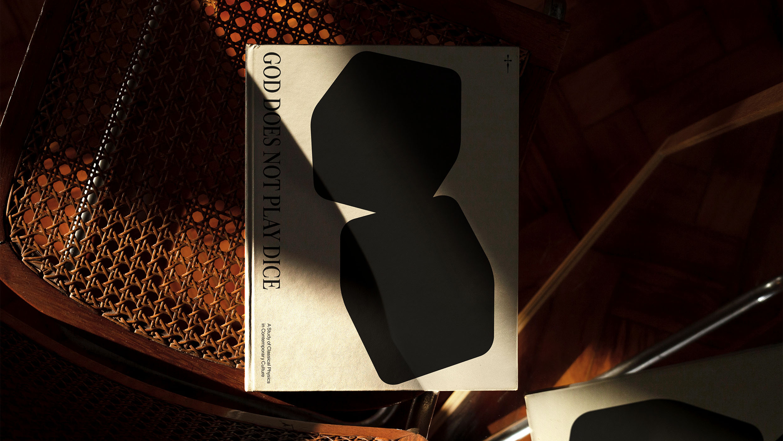
Dos-à-dos
Binding
Binding
A binding technique where two books share a single central spine, allowing them to open in opposite directions. It's commonly used for two related or complementary works presented in a single physical form.

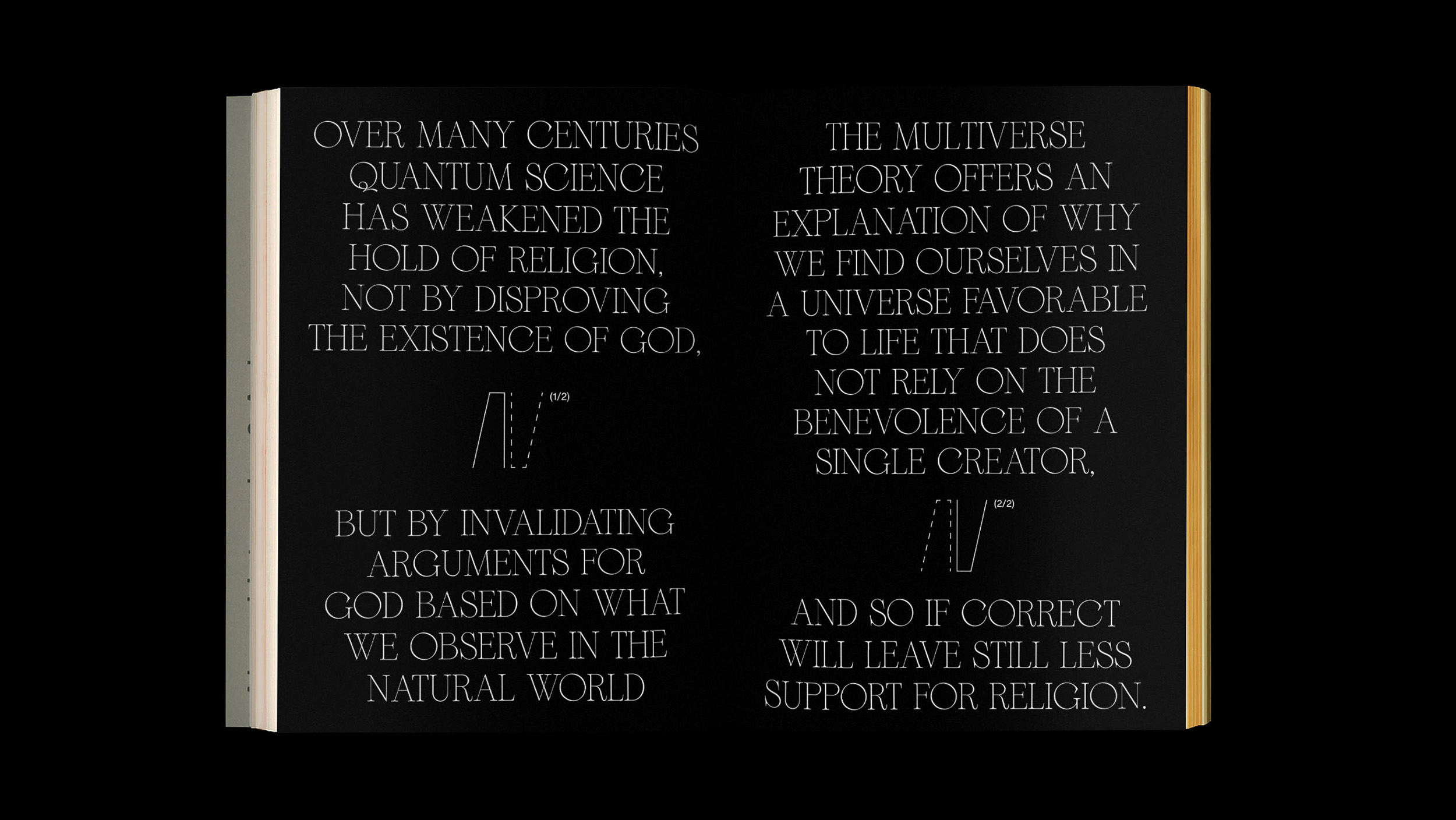
Chapters Juxtaposition
Layouts
Layouts
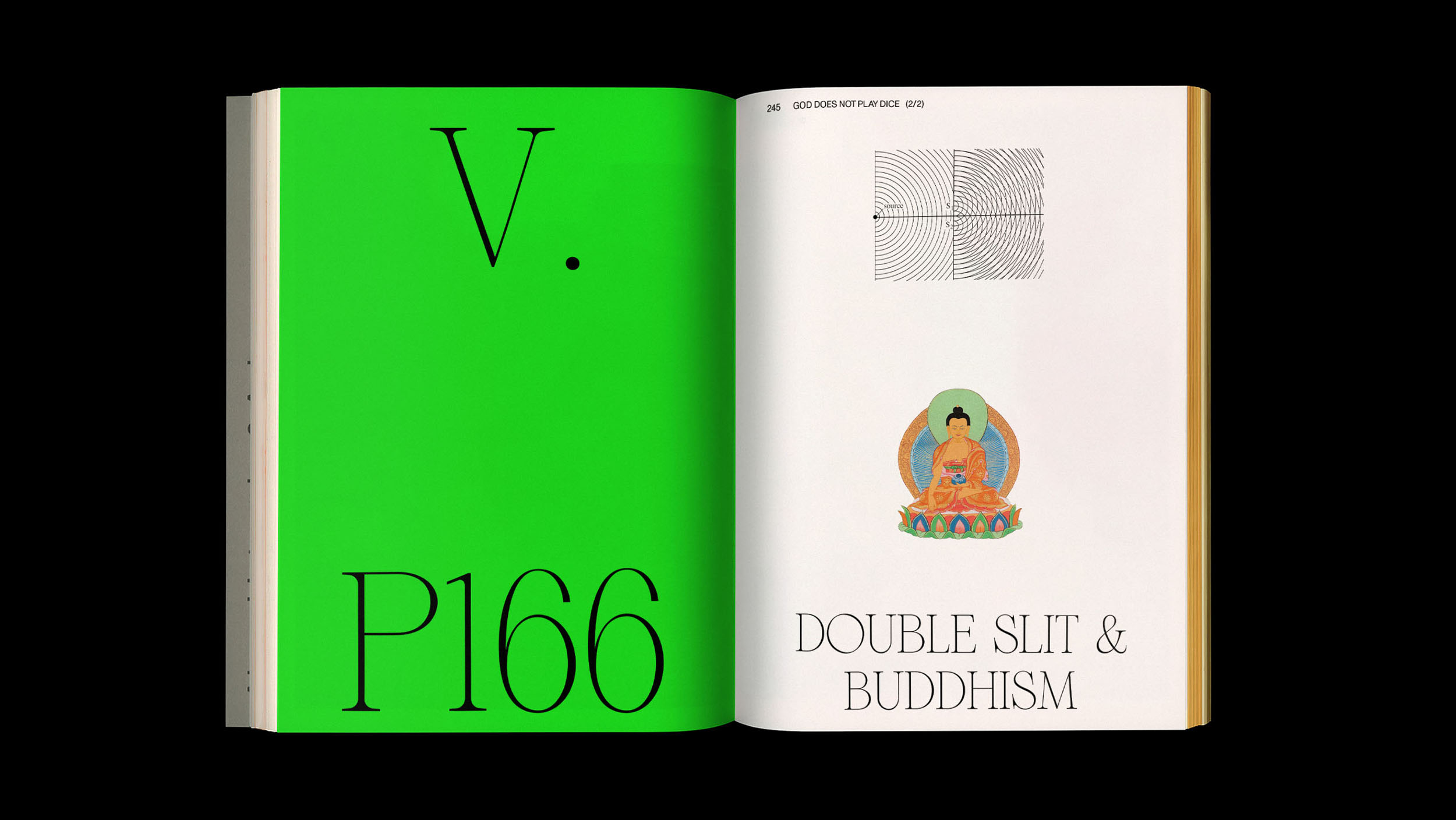
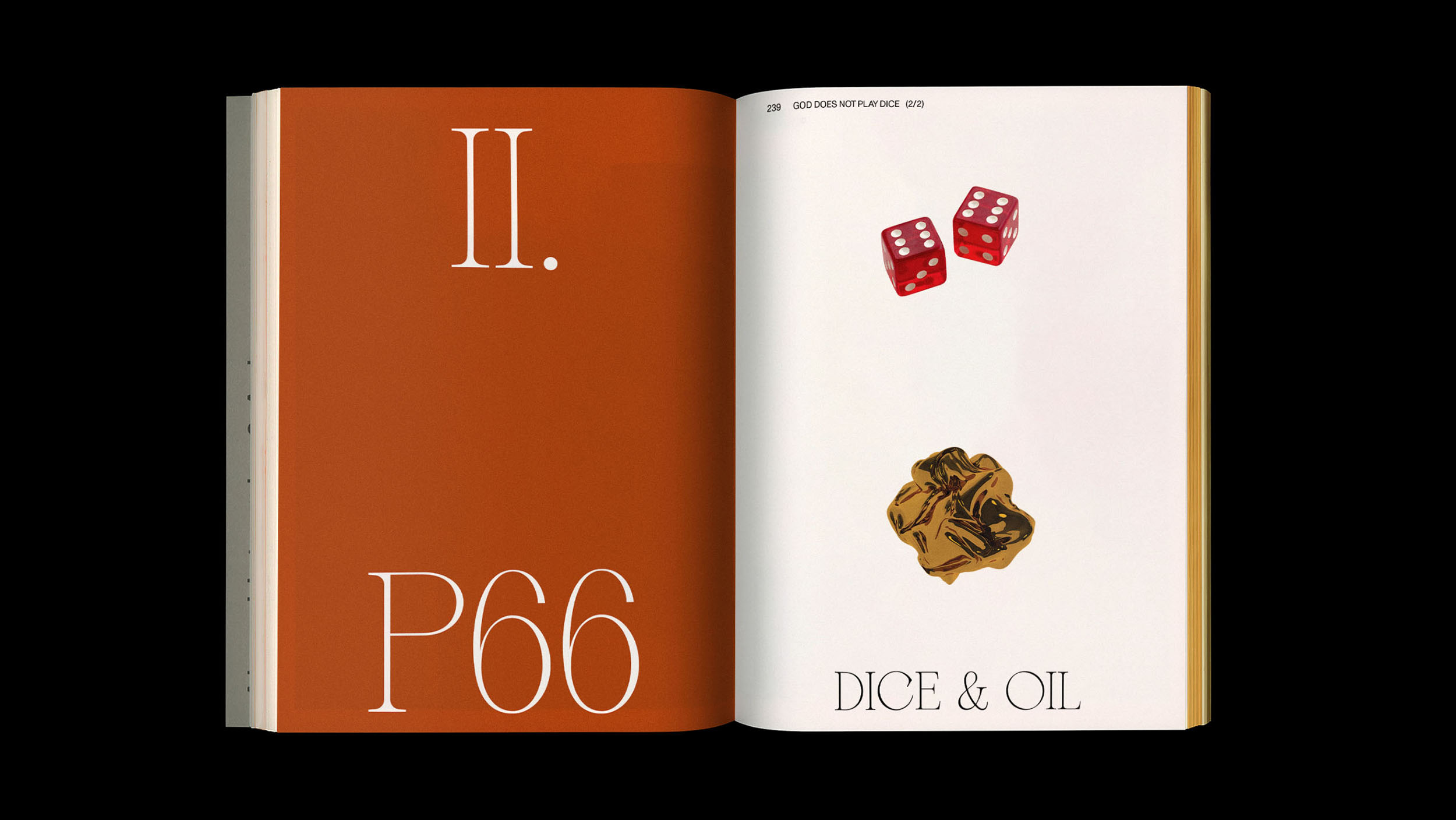
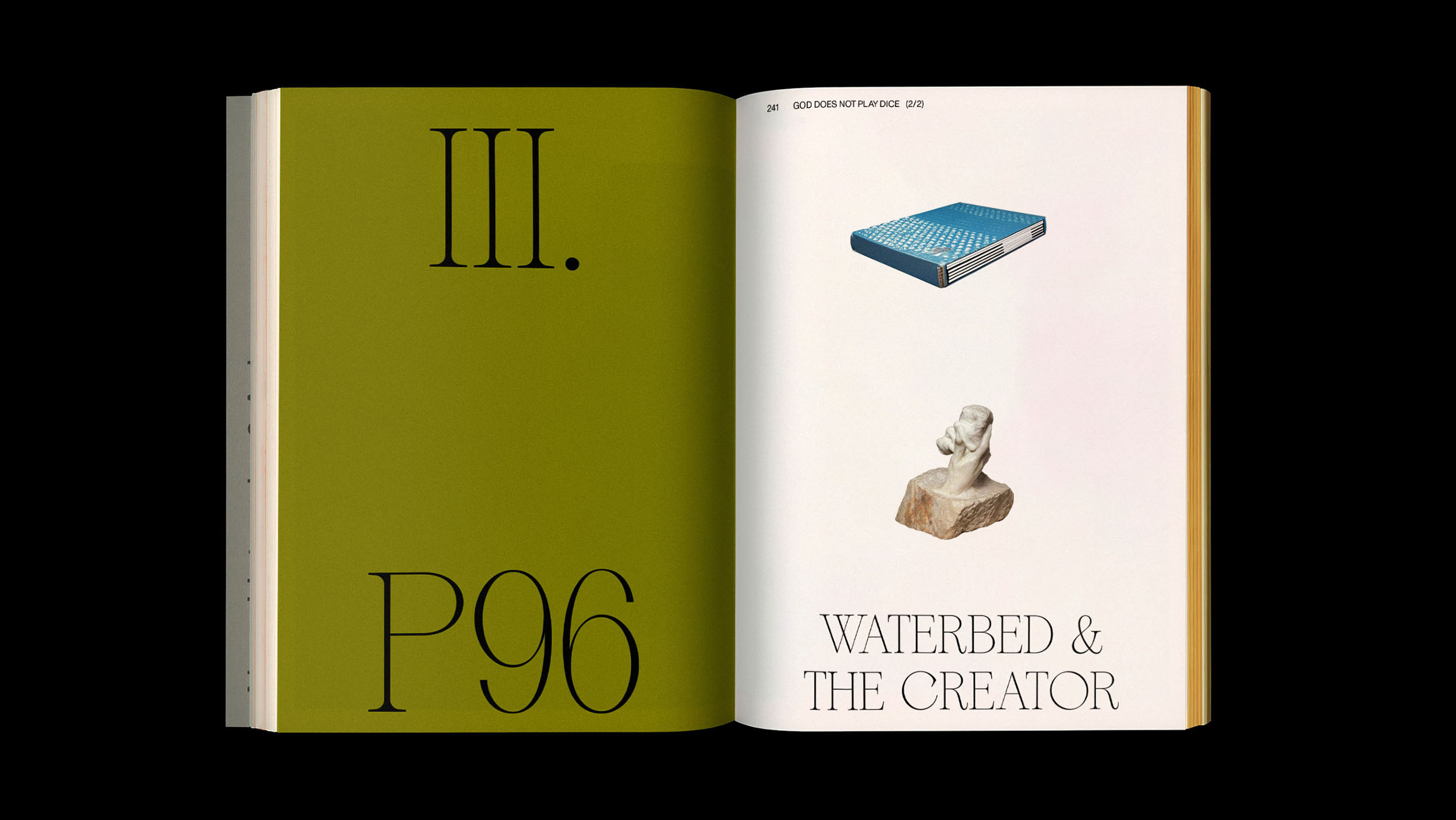
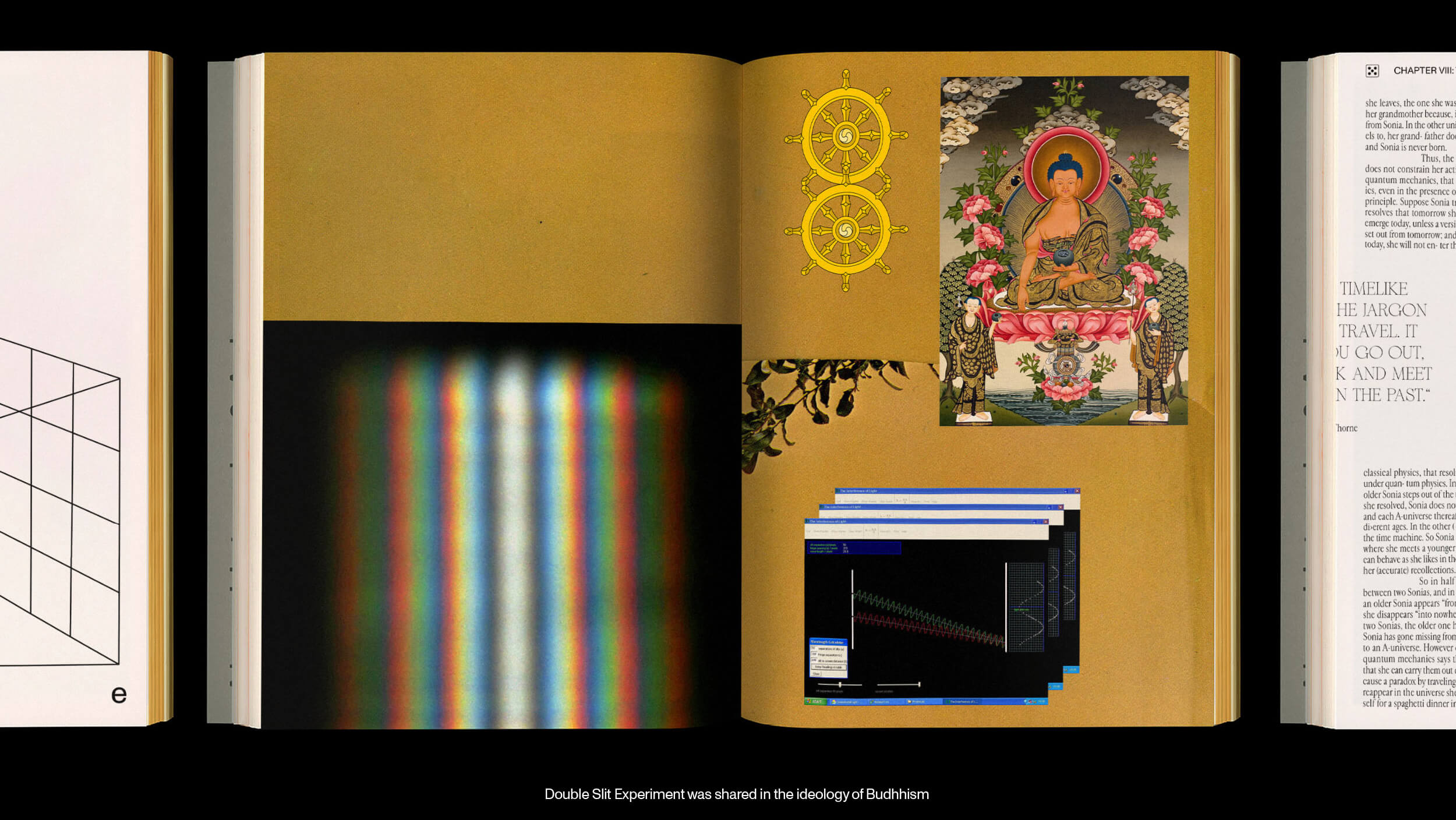
In each chapter, the book pairs seemingly unrelated objects or subjects, prompting readers to contemplate the underlying correlation and encouraging them to reveal the unexpected connections.

Typeface System
Typography
Typography
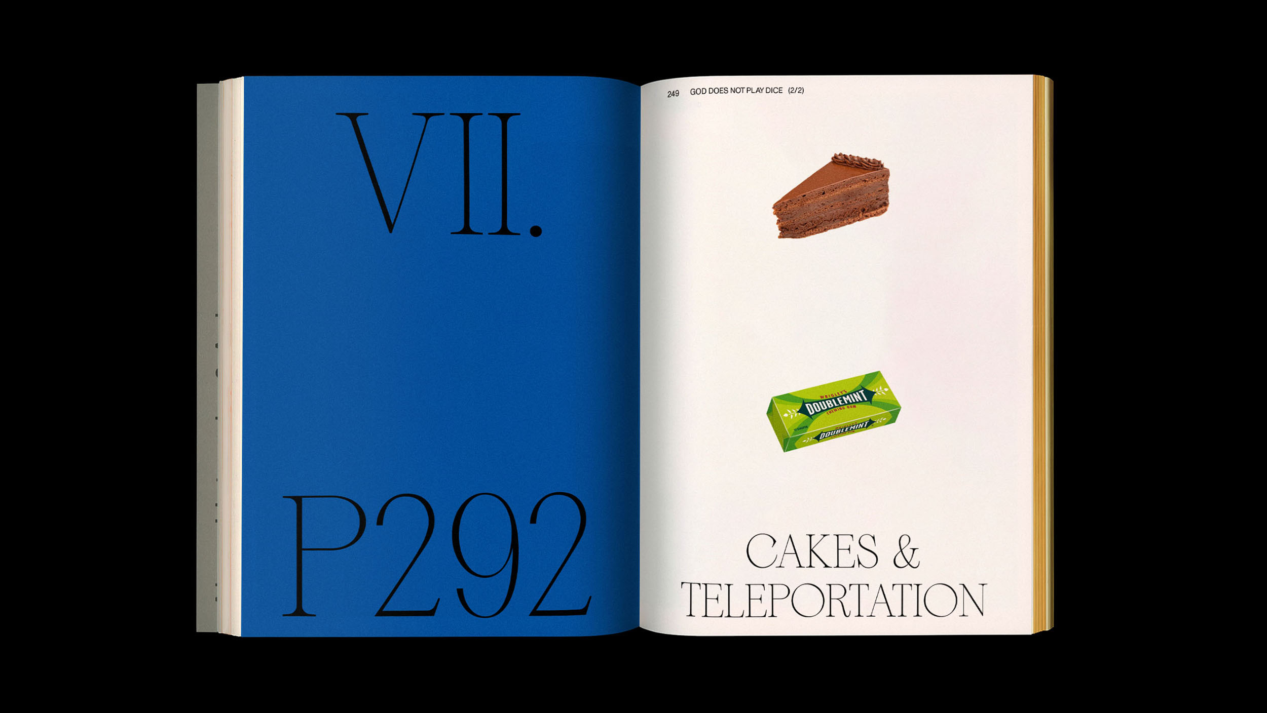
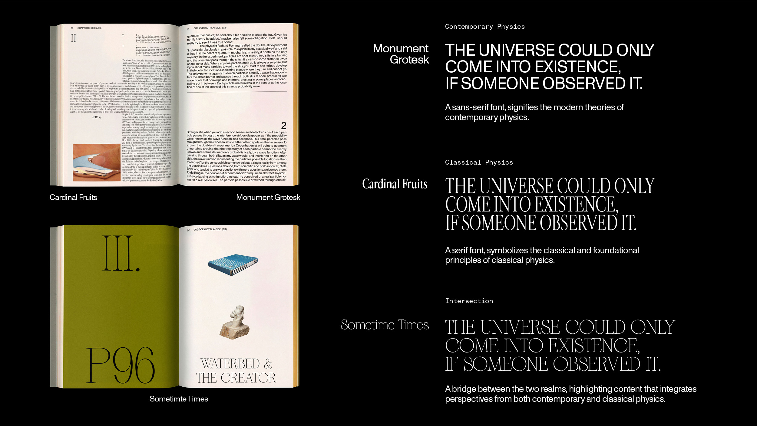
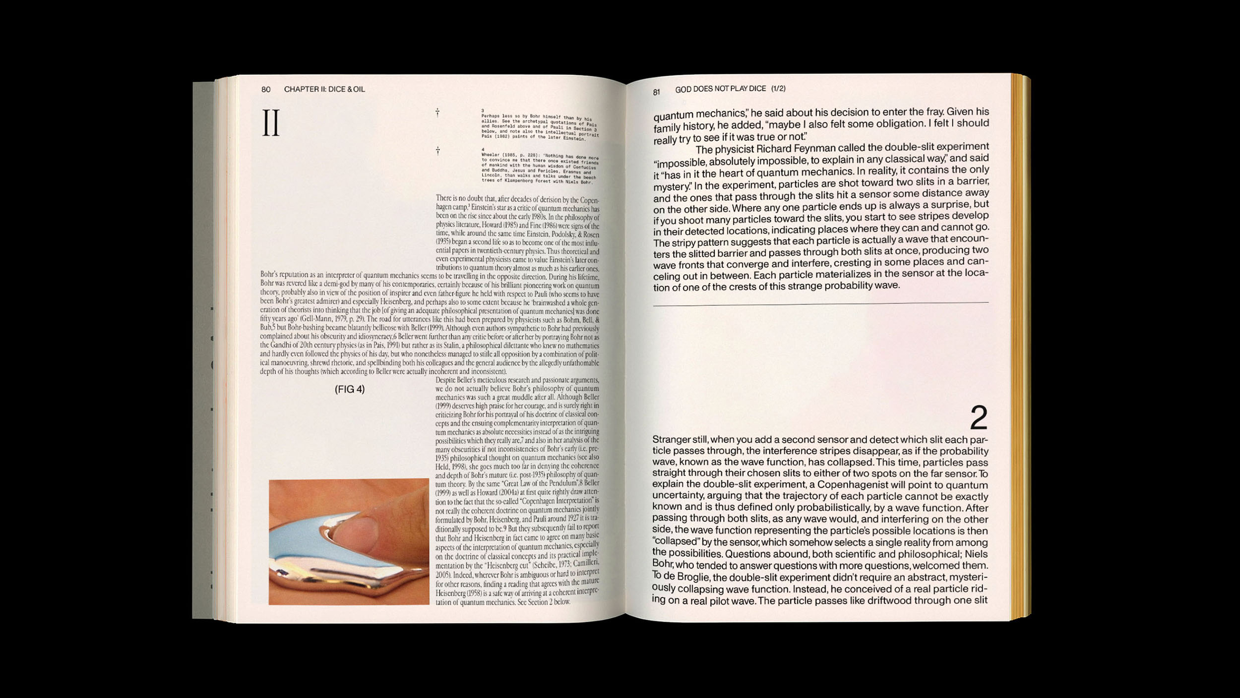
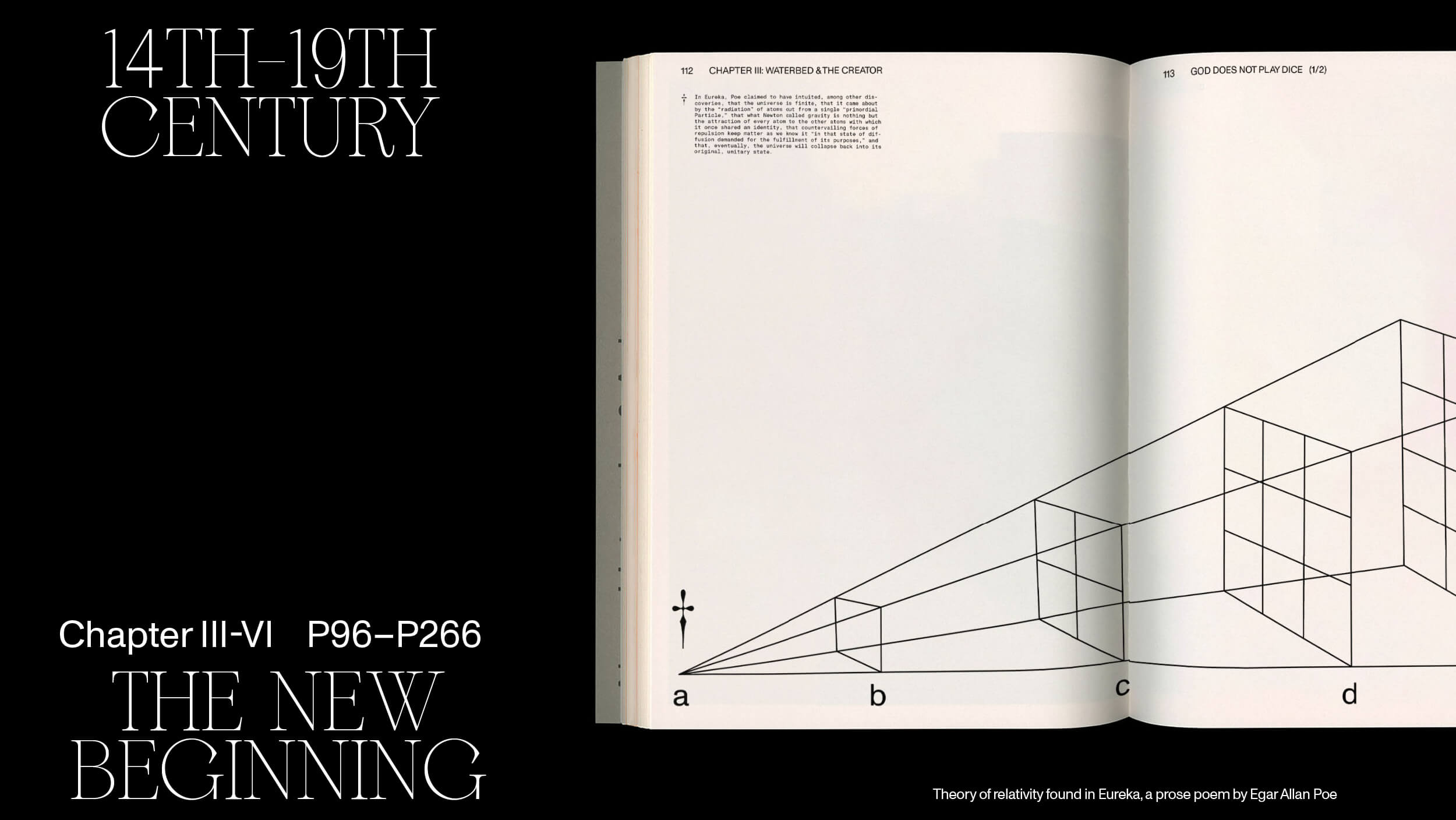
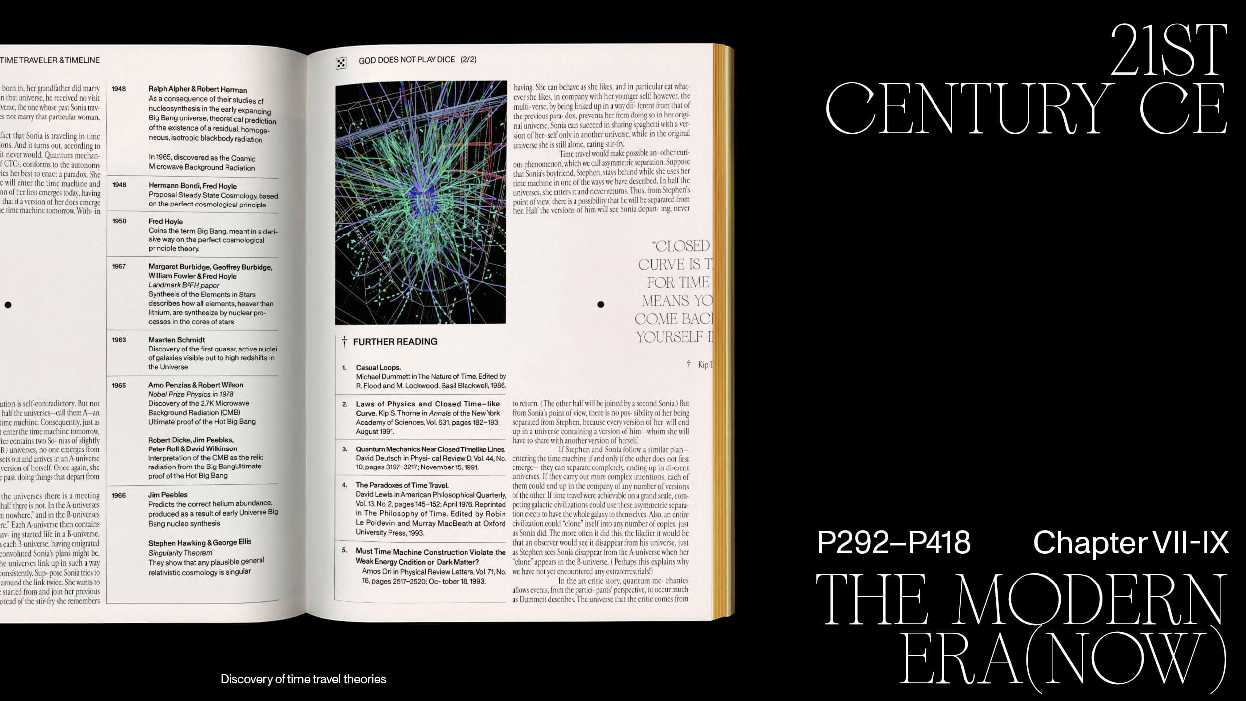
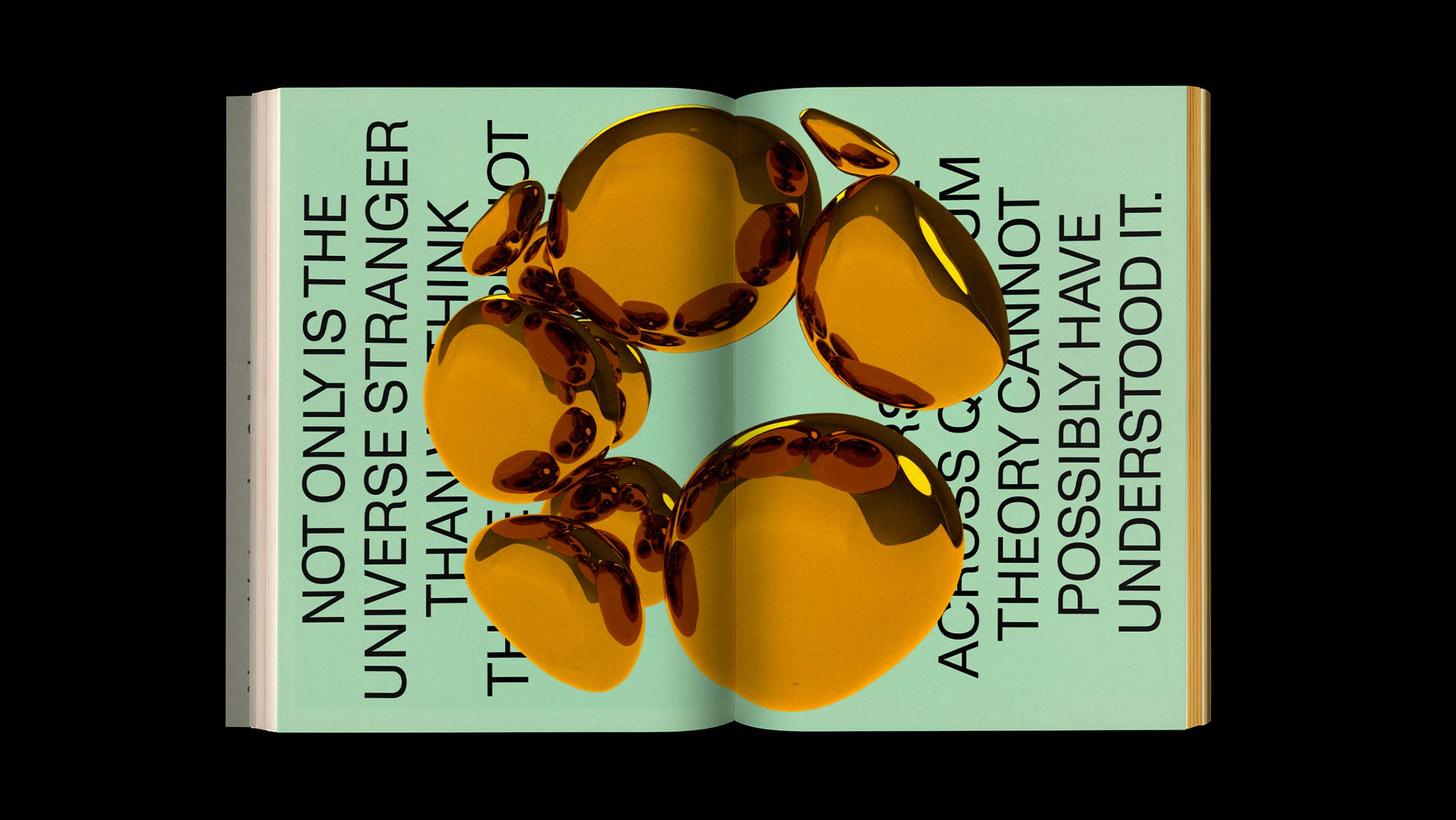
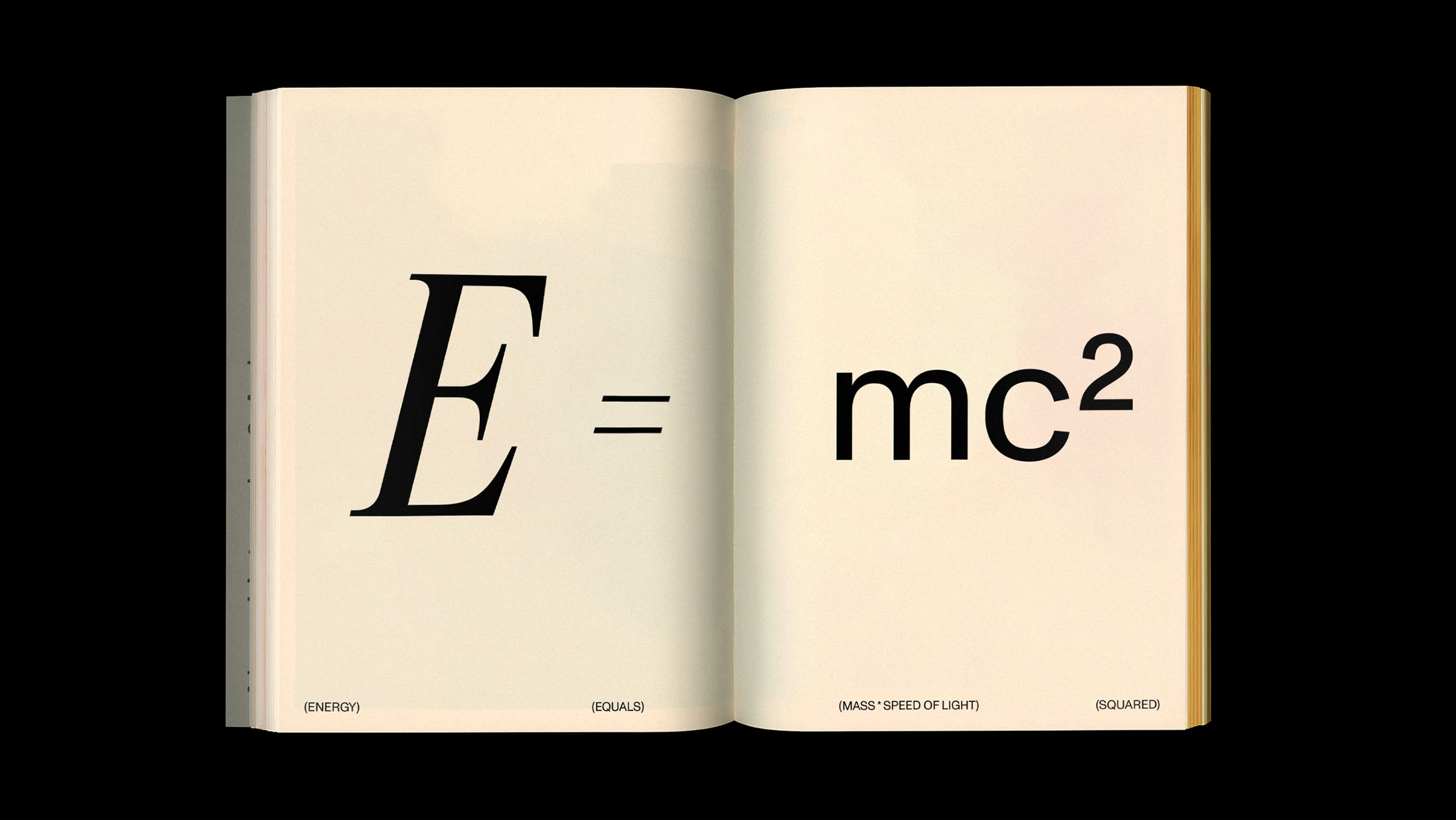
Each chapter delves into a specific aspect of the universe, presenting classical physics in serif and contemporary physics in sans-serif for a balanced and impartial learning experience for the reader.
[1] Monument Grotesk [sans-serif]
Signifies the modern theories of contemporary physics.
[2] Cardinal Fruits [serif]
Symbolizes the classical and foundational principles of classical physics.
[3] Sometime Times
Serves as a bridge between these two realms, highlighting content that integrates perspectives from both contemporary and classical physics.
Sequential Narrative
Storytelling
Storytelling
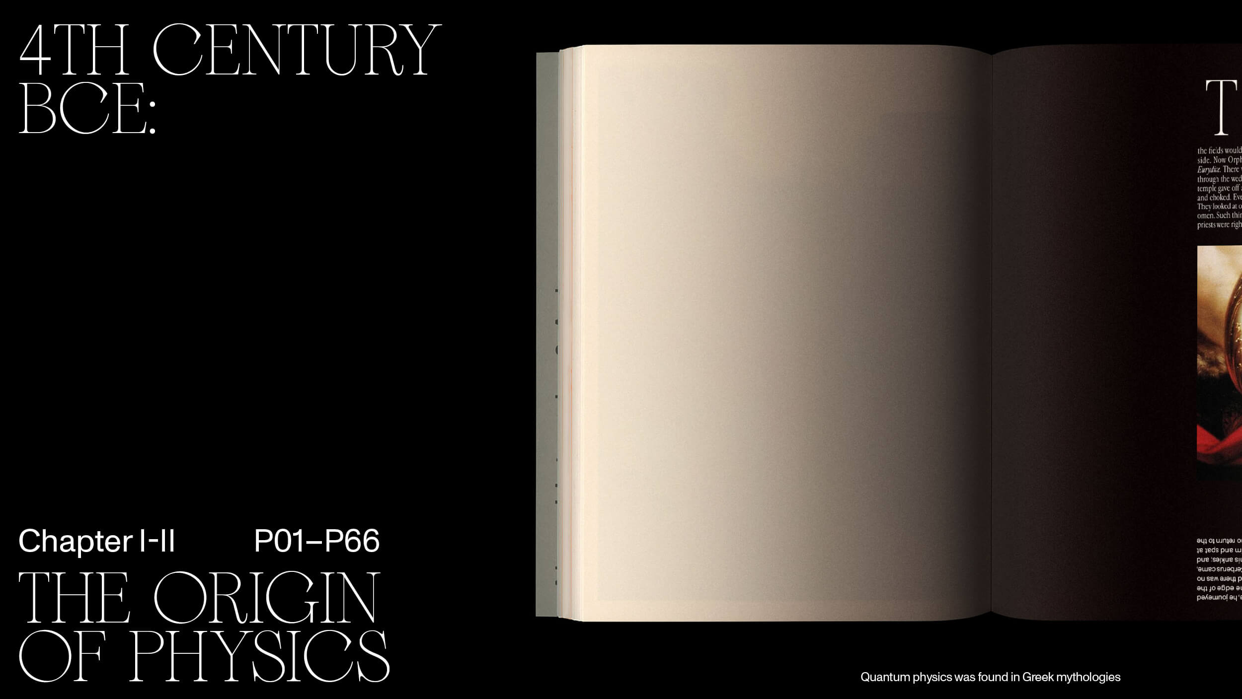
The book is structured chronologically, tracing the development of physics from its origins to the present day. This arrangement creates a sense of temporal progression, allowing readers to experience a journey through time, witnessing the evolution of our understanding of the universe.

Color of the Universe
Colors
Colors
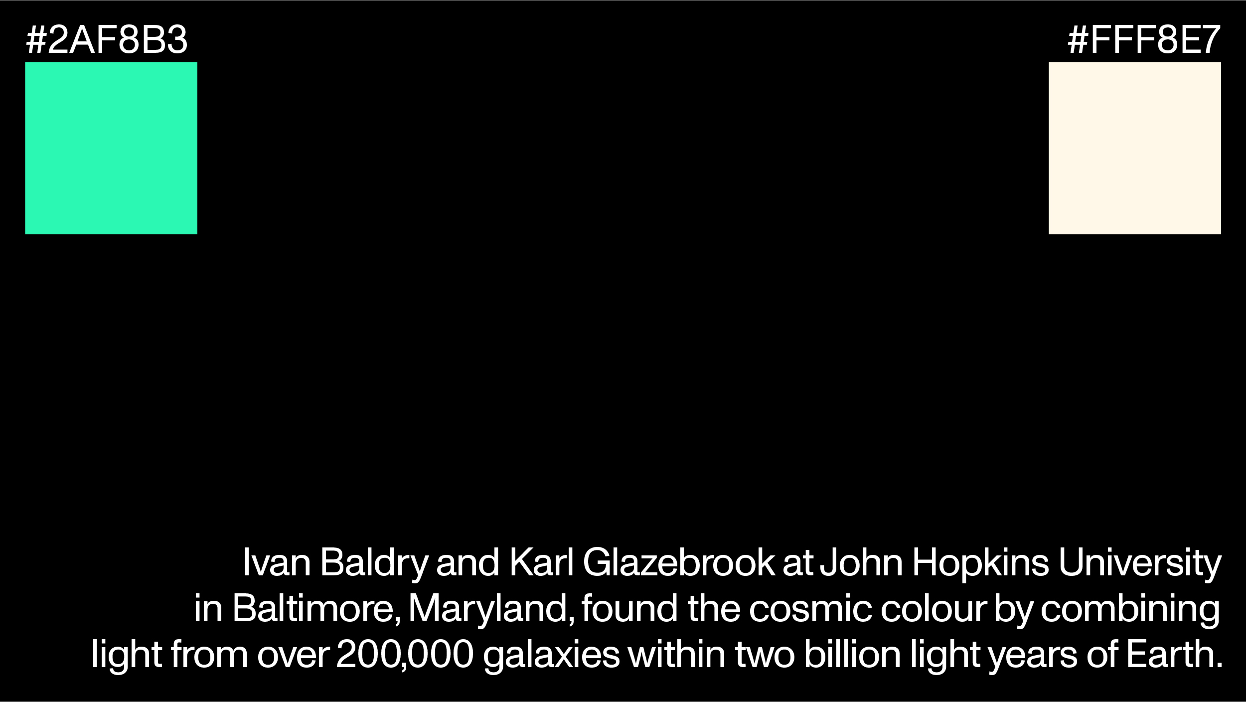
Two colors are used in the book, Torquoise green (︎ #2AF8B3) and Cosmic Latte (︎ #FFF8E7). In 2001, a study initially described the universe's average color as greenish turquoise, but a 2002 survey by Johns Hopkins University astronomers corrected it to beigeish white.
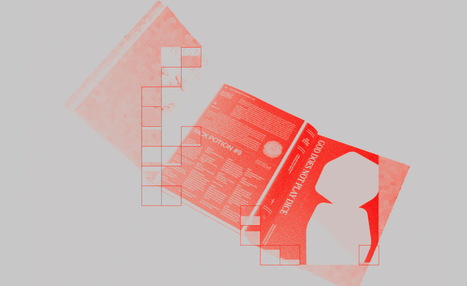
God Does Not Play Dice: Editorial System
Client: Personal, 2020
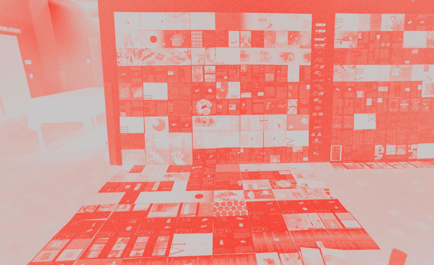
An editorial system designed to simplify quantum physics through the eyes of a visual designer. It communicates the subject through the use of distinct typefaces, color palettes, and narrative sequencing, all underpinned by thoughtful reasoning. The dos-a-dos binding method mirrors the concept of the multiverse, turning abstract ideas into a tangible keepsake for anyone curious about the universe.
For more details: ︎︎︎Full Project
For more details: ︎︎︎Full Project